
Tags
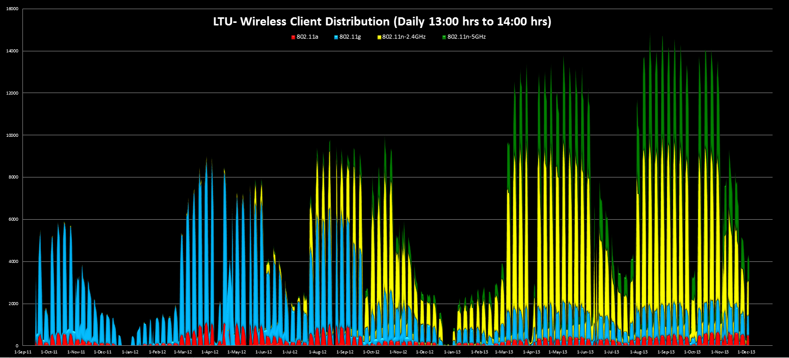
Here is a snapshot of a peak hour (1:00 -2:00PM) wireless client distribution in my campus network over past 2 years. It almost ~150% growth of number of devices connected to the network over wireless.
I would like to see another color (802.11ac) into this graph from Q1-2014 onwards.
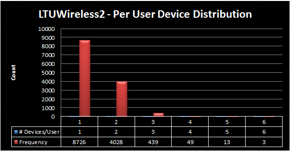
 Here is the number of devices distributed per user on a random day. Average 1.4 devices per user.
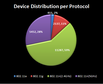
 Here is the client distribution per protocol on this day. More than 85% users are having devices supporting 802.11n.
 Are you ready with your wireless network to meet these sort of demand ?

Hi,
In the first graph I don’t see 802.11b clients.
Is 802.11b disabled on the WLCs ?
Regards
We have disabled all low data rates (1 Mbps – 11Mbps), so that effectively made none of 802.11b clients can connect to the network.
As a band, we cannot disable 2.4GHz as it is used by g/n clients in that band.
HTH
Rasika
What are you using for your management/reporting platform?
I am using WCS/Prime. I am getting daily Client count report (1.00-2.00PM) from WCS/Prime. Then I plot that data in excel to create this wireless growth graph.
2nd & 3rd derived from a wireless session detail report from WCS/Prime.
HTH
Rasika
Hello Rasika,
How do you work in Excel, manually or do you have scripts or similar tools to make your life easier ?
I work on excel manually.. not an expert on Excel skills 🙂